App Redesign: Spotify — Case Study Project 3
For this project we had to do a makeover for an existing popular app on our phones. I use very few popular apps on my phone so it was down to Spotify and nothing else and Spotify won. It helps that I’m really into music so it didn’t feel like a bad choice. I usually like to link to my teammates’ medium stories to give you a more complete story but this project was a solo mission so there’s no profile for me to redirect you to this time.
Spotify to those of you who don’t know is one of the first major music streaming apps and one of the biggest ones now, competing mostly in the space with Apple Music. For most people it’s their go to resource for music, and it even has podcasts and audio books now.
For this project we didn’t have to do any research, interviews, testing. No empathizing, defining or ideating, it was all just three days to build a hi-fi wireframe. Even still we have a process to do things the right way. We had to do many things:
Clone three screens
Heuristic Analysis
Visual Competitive analysis
Brand Attributes/Mood-board
Make a Style Tile
Make a Prototype
So to start I had to clone three screens.
Cloning the screens
Cloning the screens took the bulk of my time, I think if I had to make them from scratch without having to adhere to a model it would have been quicker but since they had to look the same exactly I spent many hours fiddling with font sizes and moving things around til they were as close to pixel perfect as I could manage. I notice now some things I didn’t see before when I was in the middle of it.
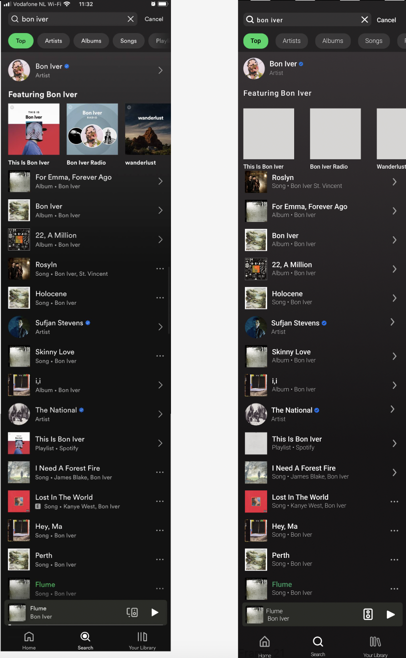
The originals are on the left and the clones are on the right.

I now notice that the cards for the albums on the top of the home page are slightly bigger than the originals, and that there is some spacing issues with the “Good morning” header and the “music” and “podcasts and shows” buttons.
Original is on the left and clone is on the right.
I think I did better on this page even if there is some alignment issues with some of the arrows. I also didn’t have the right images for some of the cards.
Original on the left clone on the right.

This is the one I’m proudest of. I think I did quite a good job on it. It looks quite like the original though there are some sizing issues I didn’t spot.
Heuristic analysis
I have to say, Spotify is a very well designed app. There wasn’t really much to say about it, I do have some notes if you’ll indulge me, but I almost feel like I had to make problems up.
Visibility of system status is good, I feel like Spotify does a good job indicating things using their Spotify green to highlight things that are selected or even just highlighting the icons on the nav bar to indicate selection.
User has a lot of freedom and control, you can still control the player even if you leave the now playing screen through a card at the bottom of the screen.
I think the only thing I’d really change is that the icon to play songs is “…” and the icon to see more for artists and albums is “>”. I think “…” is universally the symbol to find out more, like you would if you clicked on an album or artist to see the songs available and that the “>” looks like a play button like what you’d expect would happen if you clicked on a song so I’d swap them around.
Visual competitive analysis
I decided to look over other apps that have to deal with music selection to think about what the new Spotify could look like. We were free to compare with any app but I thought that it would be better to compare to apps that dealt with music if only because we’d have comparable features. As a collector of vinyl I had to use the Discogs app, it’s where I find my vinyl and I generally like the look of the site. I couldn’t ignore Apple Music, as Spotify’s main competitor it’d be wrong not to see what the competition is doing differently. Finally I took a look at Shazam, it’s the app I always forget I have when I need it, but it deals with and lists music in a pleasing way so it made sense to take a look at it.
From left to right: Discogs, Apple Music and Shazam

I thought Apple Music and Shazam looked too much like what Spotify already looks like, a night mode, future looking, music app with one solid color for buttons. I decided to take the most of my inspiration from Discogs, it looks old school but that’s not a bad thing, I like it.
Brand attributes/mood-board
For the mood-board we didn’t have any research or user personas to take into account so it was all freestyling. I decided to go with my general aesthetic for music if that makes sense.
I had some time late at night after doing the mood-board so I decided to do some informal testing. I showed my friends this picture and (you can play along at home) I asked them to come up with three words and one sentence for each of the words to explain them. Since it was informal testing I didn’t record their answers and some of the answers would have been in portuguese anyway so it doesn’t matter, but what does matter is that they all said things relating to the words I was thinking of even if it wasn’t always exactly in the same words. Something like:

Vintage
Personal
Routine
Comfy
Intellectual
Style tile
I then came up with colors, (I literally colorpicked them from the mood-board, but I’ll explain later), and came up with some typography. The typography I had no idea what to do with, fonts and typefaces all look the same to me but I found two I liked. Elegant typewriter, like the name suggests, emulates an old school typewriter which I thought was quite comfy and vintage in a way I liked, and then there was Quicksand which I thought looked quite intellectual. Having chose those I made my style tile.

I stole all of the colors from the mood-board, the dark brown came from a shelf in the library, the light one from the coffee shop table. The gold was a vinyl separator. The greys came from the city, the dark one from the asphault and the light one from a building. I think you’ll notice where the red comes from if you look at the cityscape picture, I’ll let you figure out where that one came from.
Make a prototype
All that was left to do was make a prototype and all I had were two days I wasn’t supposed to have. We were given three days, wednesday to friday to present on monday. We were told we wouldn’t have to work the weekends but it turns out that I needed to work the weekend. After wasting all of saturday on a design I hated (I wish I could show you but I deleted it accidentally) I decided to simplify my workload and use more of Spotify’s existing architecture in making the new prototype.

I added some small bars as dividers and changed the colors a little bit. It’s not the most drastic change but I think it has a completely different feel. It kind of reminds me of an old guitar, or a record player in a way which is what I was looking for. I think I made some mistakes with regards to color composition and contrasts, like the “loop” button on the third page is very hard to read because of that gold on that grey. I would probably revisit the colors and adjust them in a future iteration.
Final thoughts
I thought I was going to dislike this project more than I did. I thought that not having any Ux to do meant this was going to be a chore but it wasn’t, it was more fun than I expected. Ui work is fun, it may not be what comes naturally to me but I enjoyed myself. Especially doing the competitive analysis, coming up with the mood-board and picking out the colors. I wish I had more time to test and iterate because I’m not completely satisfied with my design, I think it still looks somewhat off but it looks like the kind of design I wish there were more of in apps.